01
Research & Discovery
"This is about creating a digital space where everyone feels included and empowered. And that's what makes all the difference."
My client it's a humanitarian organization dedicated to saving lives worldwide, responsible for collecting and distributing blood, training in first aid, and promoting health programs. Its website consists of two main sites: one more general and the other focused on blood donation.
The goal is to completely redesign these sites using Design Thinking by conducting user research, defining insights from findings, creating a visual redesign with an accessibility-focused design system based on ADA WCAG guidelines, and testing to iterate the product.
Two disconnected sites. A trust gap.
Imagine needing help and not knowing where to go. That's the experience many users faced across this organization's digital touchpoints. Two disconnected sites, inconsistent language, scattered content, and no clear call to action.
For an organization whose mission is to save lives, that's not just bad UX - that's a trust gap.
We set out to redesign their digital ecosystem not only to improve usability and accessibility (WCAG 2.2 AA compliance), but to create a user journey that builds confidence, encourages action, and reflects the empathy at the heart of their mission.

We began with qualitative research to uncover user needs, motivations, barriers, and mental models. This phase is all about learning, understanding, and setting the stage for a successful project. The insights gained here shape every decision moving forward, making it essential to success.
Findings were distilled into key insights to guide decisions and test new designs.
Methodology · User Interviews
Sample specifications
In this phase, we conducted interviews using Zoom, completing a total of 17 sessions. During this time, I took notes and provided support by asking additional questions based on the users' behaviors.

Interview's objectives
To identify common patterns and essential features that users anticipate and value in their interaction with the sites. This could include design elements, functionalities, or content types.
To understand the challenges or pain points users encounter with the current site experience, and to discern their underlying needs or expectations from the experience in general.
To identify potential areas where innovative solutions could be implemented to simplify, personalize, and enhance the intuitiveness of the user experience across the site ecosystem.
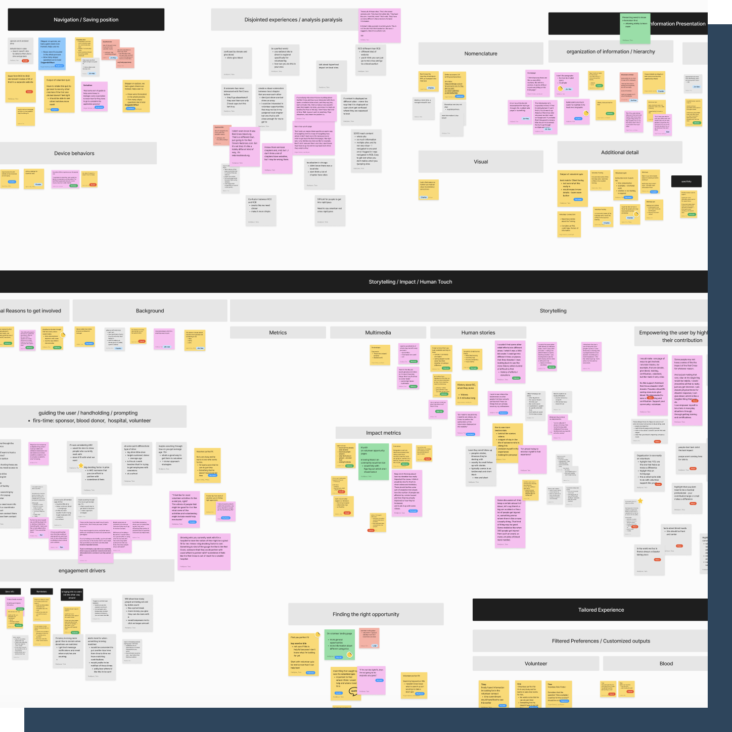
Once the interviews were completed, we gathered the recorded information and categorized it into sections using a matrix.
These sections included background context, pain points, opportunity areas, and a "magic wand" category (which allows users to suggest any improvements without any limitations).
This approach helped us gain a clear overview and initiate an analysis phase, clustering the qualitative information into groups. This way, we could identify patterns and extract common themes.
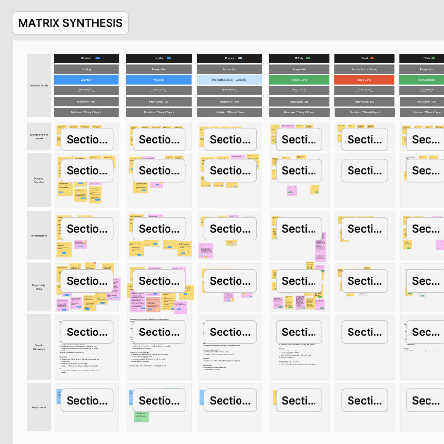
Three lenses for the data
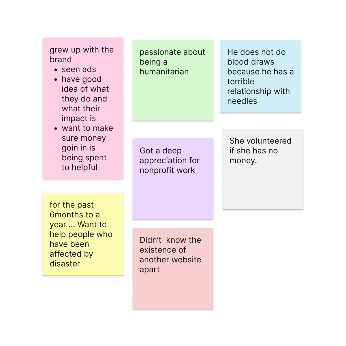
Background context of each interviewee - relationship with the organization, prior experience with the websites, and motivations around blood donation.
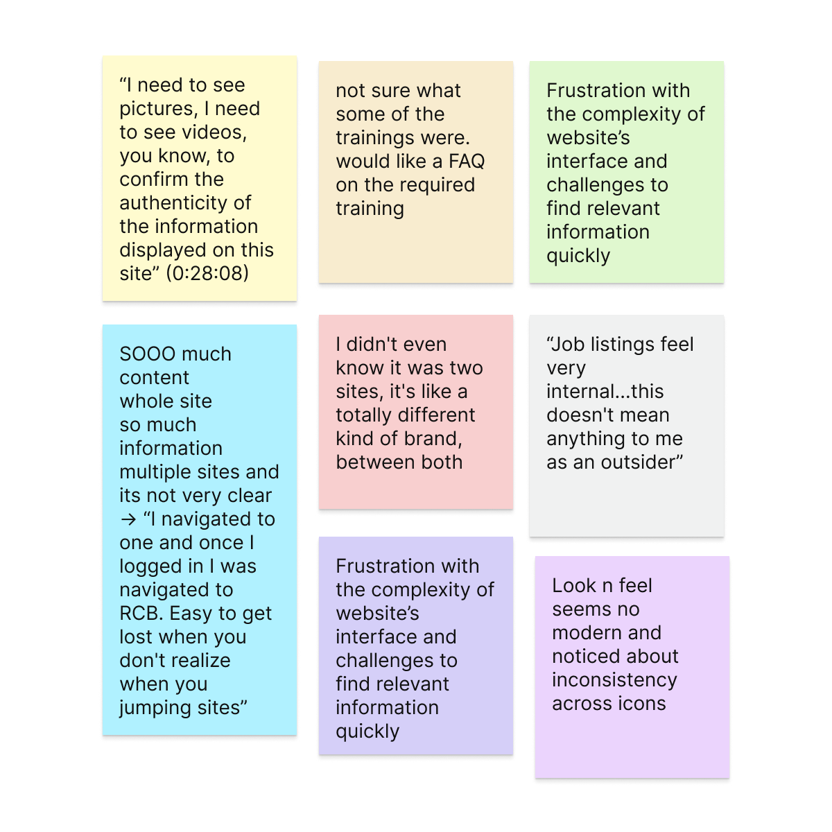
Specific frustrations and barriers across the digital touchpoints - inconsistent language, scattered content, unclear next steps, and broken trust.
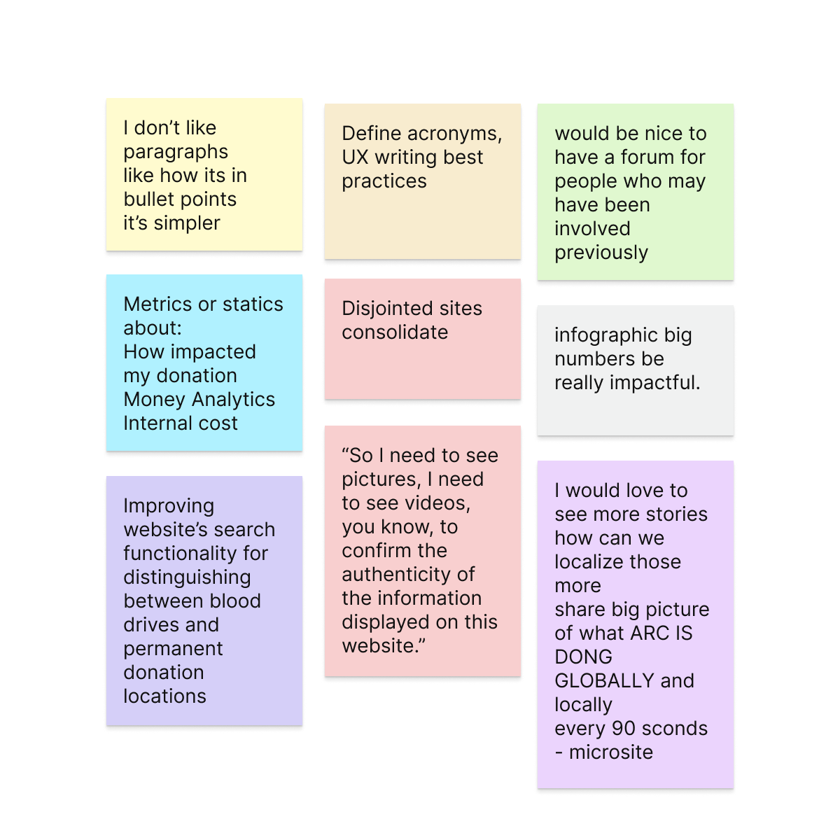
Areas where innovative solutions could be implemented to simplify, personalize, and enhance the intuitiveness of the experience.
At this stage, we identified the main patterns and organized them to make it easier to detect the themes that have the most impact on the experience.
This process helps us make informed decisions for key design efforts and fosters collaboration with stakeholders as well as business and technical teams.
Research Insights
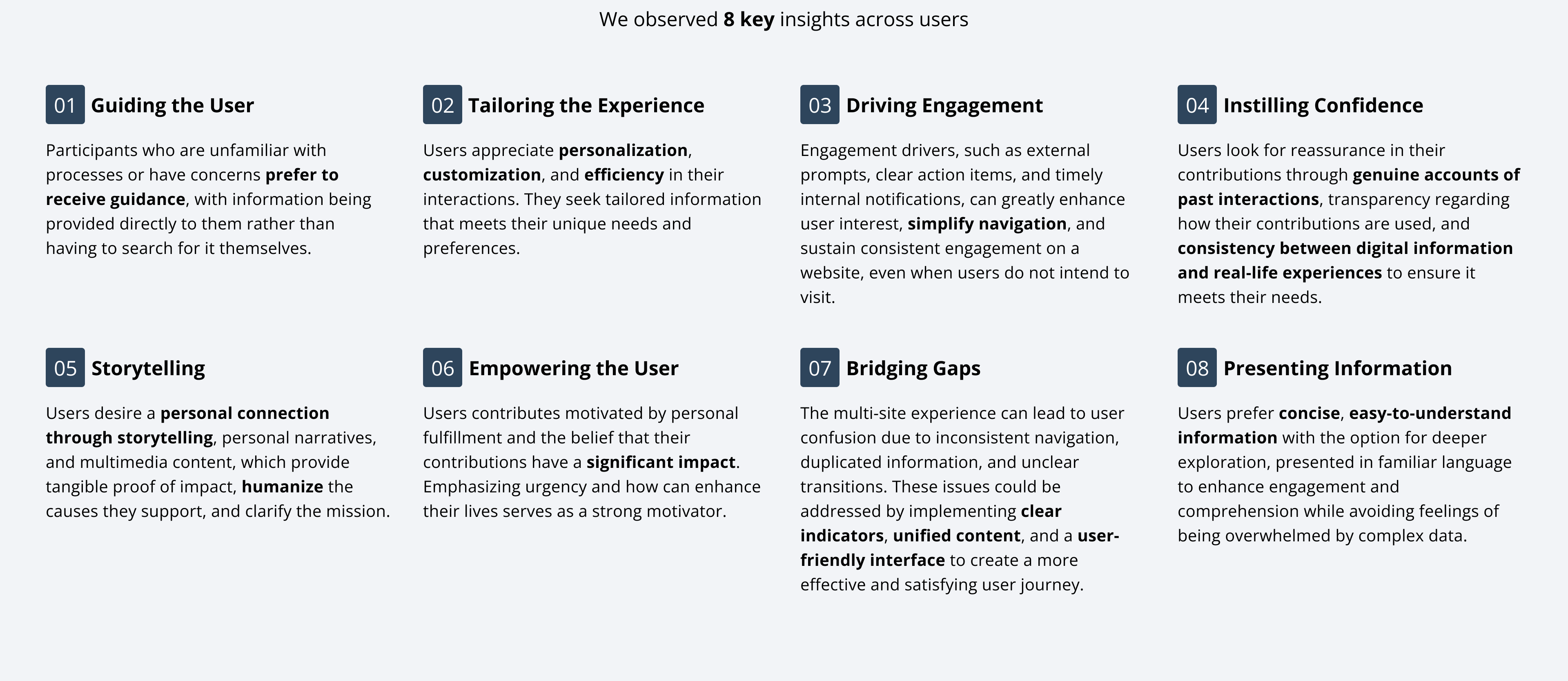
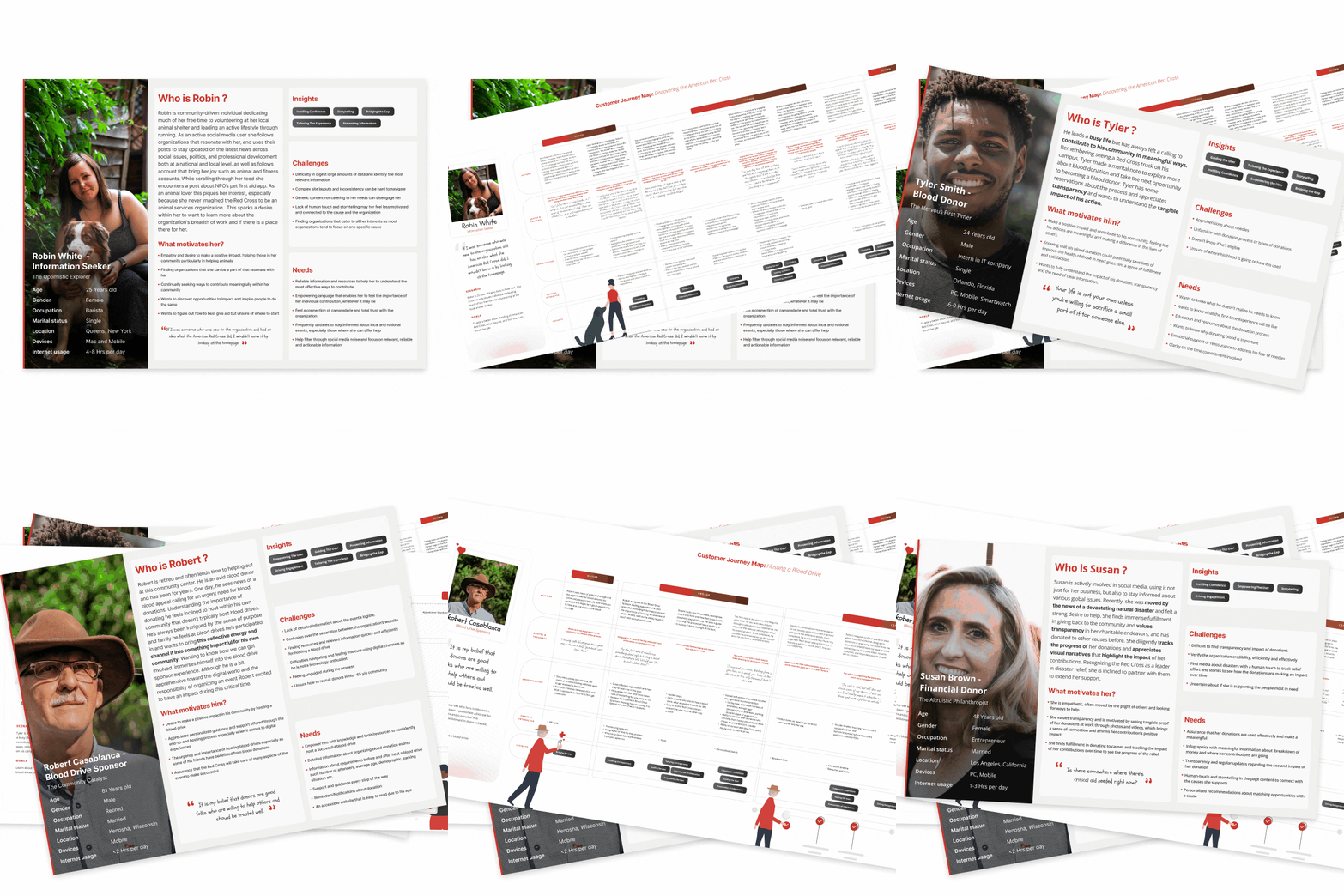
We clustered patterns into 7 key themes and created 7 unique user personas, each with clear goals, fears, and digital journeys. These personas weren't just artifacts - they directly informed navigation models and content prioritization.
With strategic insights in hand, we reframed the product scope as one unified digital experience rather than two isolated sites. We co-created user flows with the client to prioritize:
We built out low-fidelity wireframes, followed by high-fidelity prototypes, validating each iteration with stakeholders.
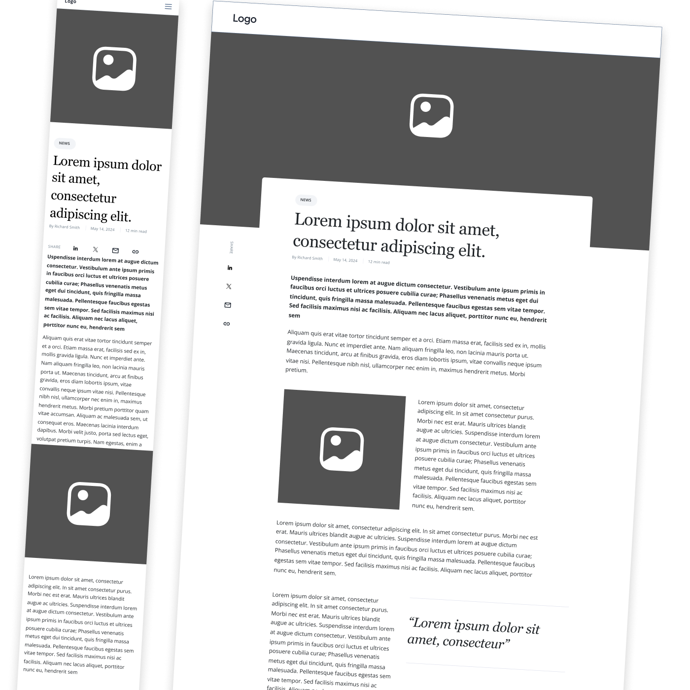
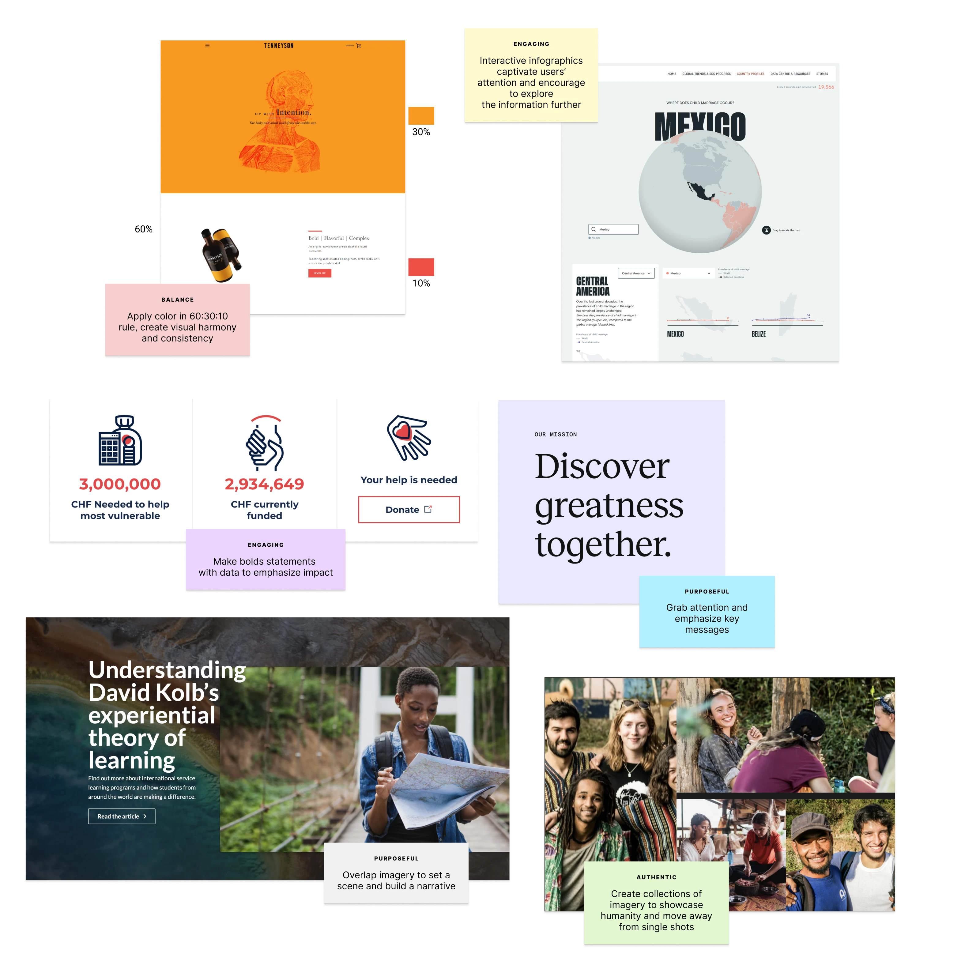
So, to figure out what our UI should actually look like, we dove headfirst into the internet and explored a ton of websites.
It was like a digital scavenger hunt for inspiration! But we weren't just looking for pretty pictures - we made sure accessibility was our north star, guiding us to make choices that work for everyone.
Basically, we wanted a UI that's both stylish and super-inclusive.
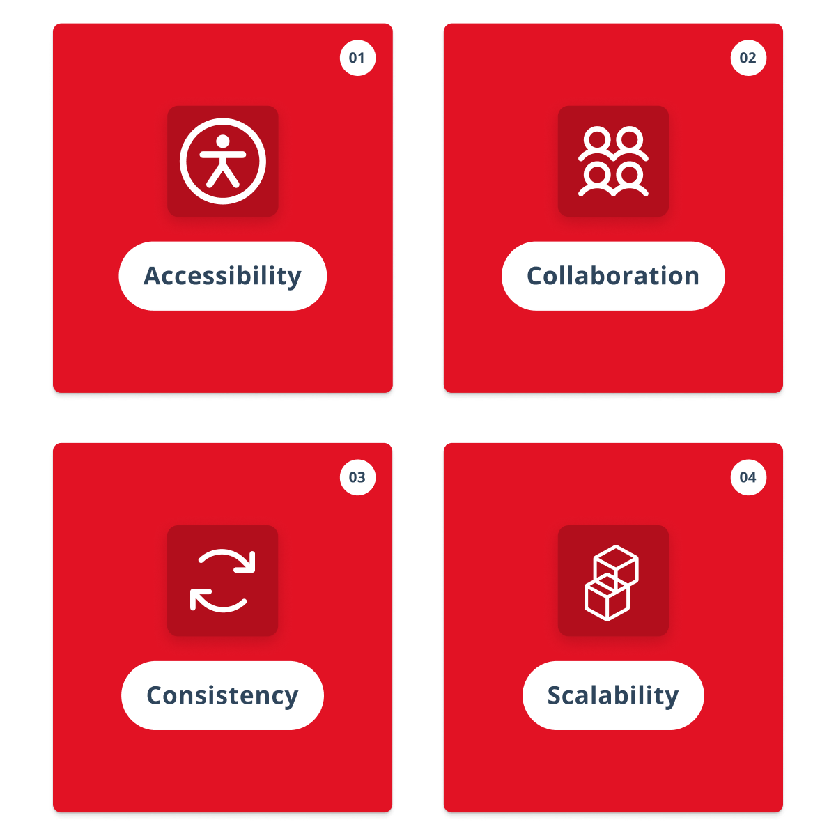
Each of these pillars is like a superhero, working together to build an interface that doesn't just check the boxes for user needs, but also sparks a little bit of magic, trust and loyalty.
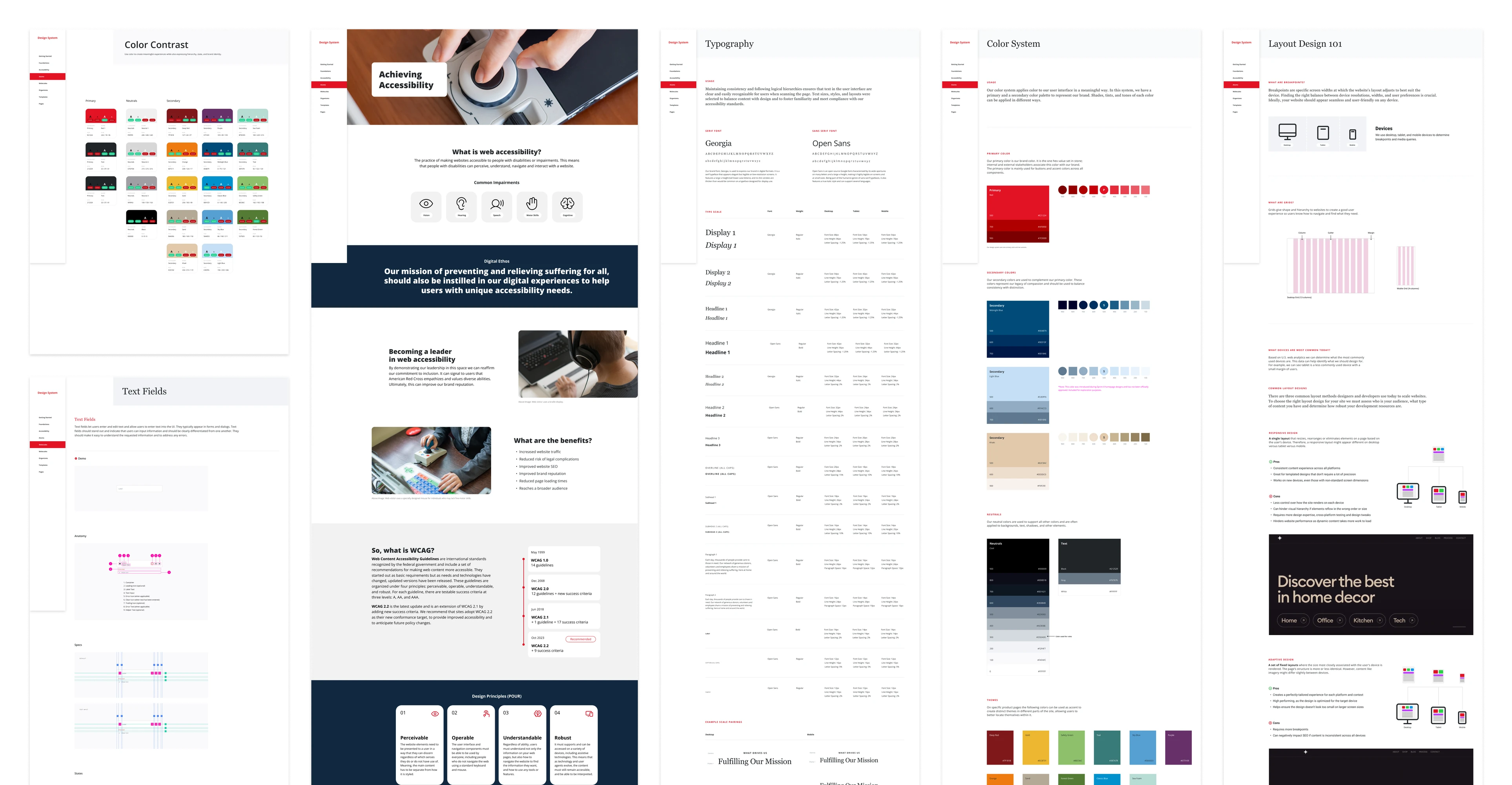
We've focused on creating interactions that are intuitive, accessible, and efficient. By employing consistent patterns, responsive design, and thoughtful error prevention, we ensure the interface functions seamlessly for all users, regardless of their skill level or device.
This approach minimizes frustration, enhances user satisfaction, and makes the experience both effective and enjoyable.
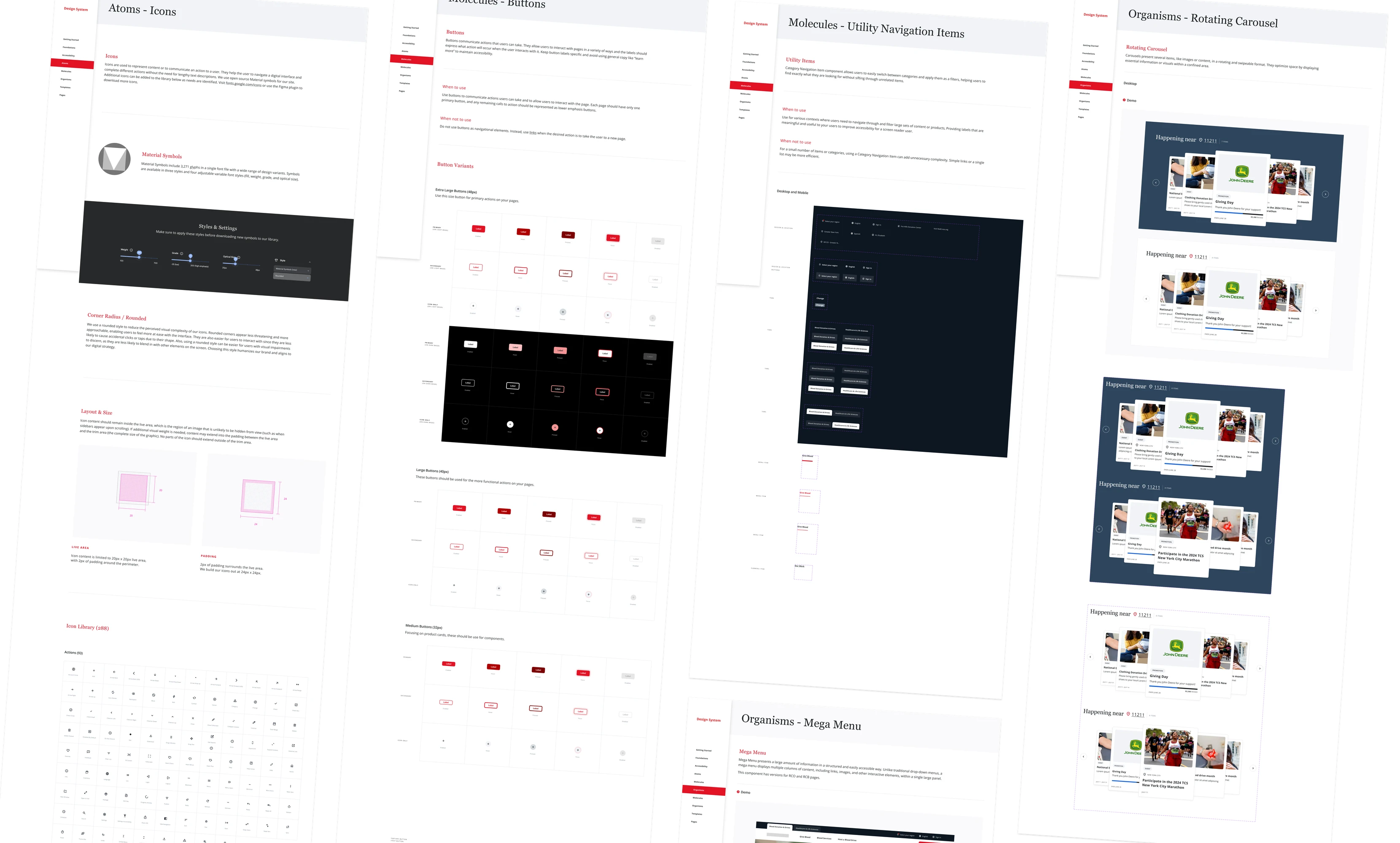
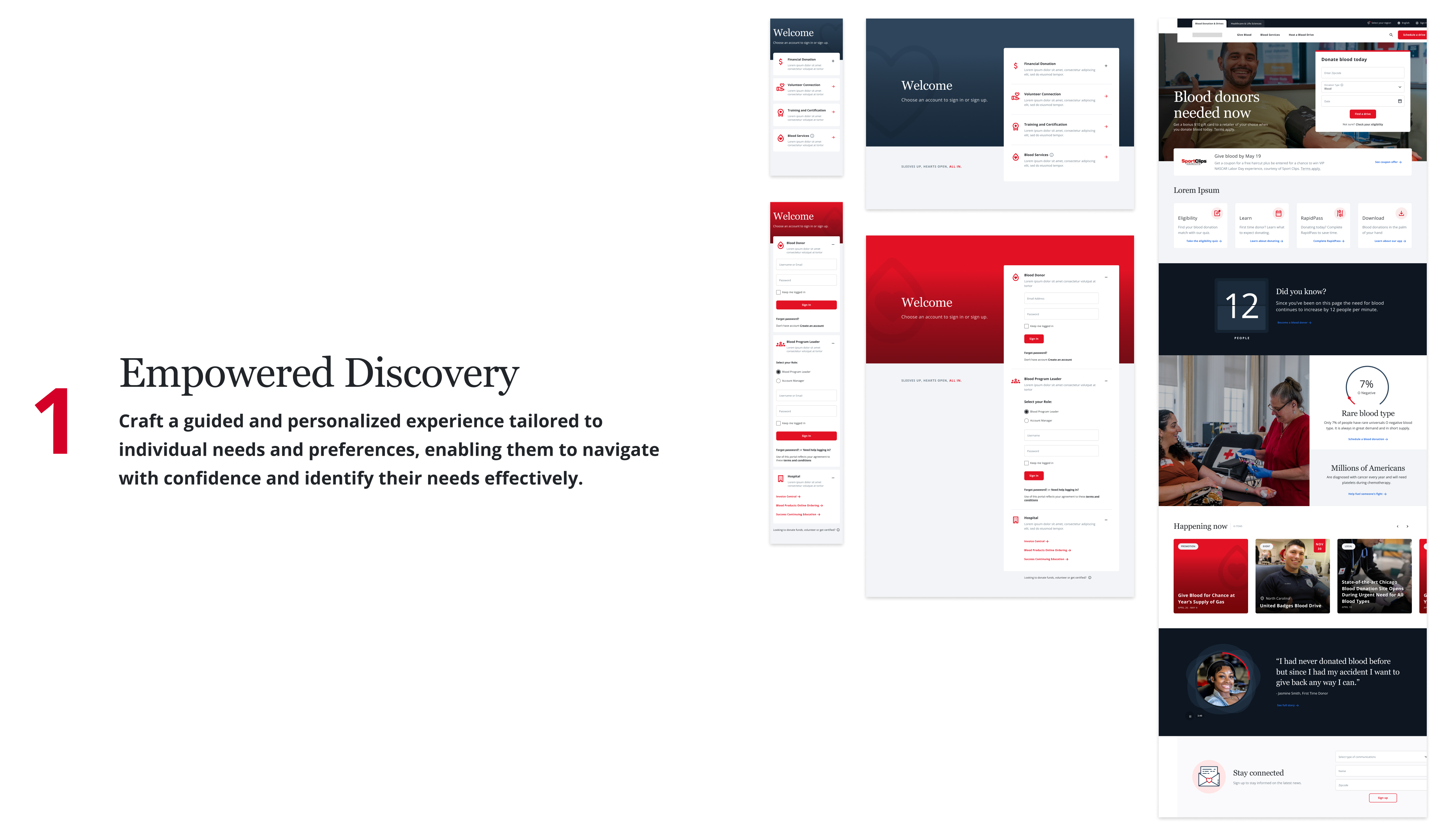
This philosophy helps create personalized experiences that engage users, prioritizing accessibility and user trust to increase participation and donations. By combining these elements, we craft intuitive and accessible journeys that empower users to navigate with confidence and purpose.
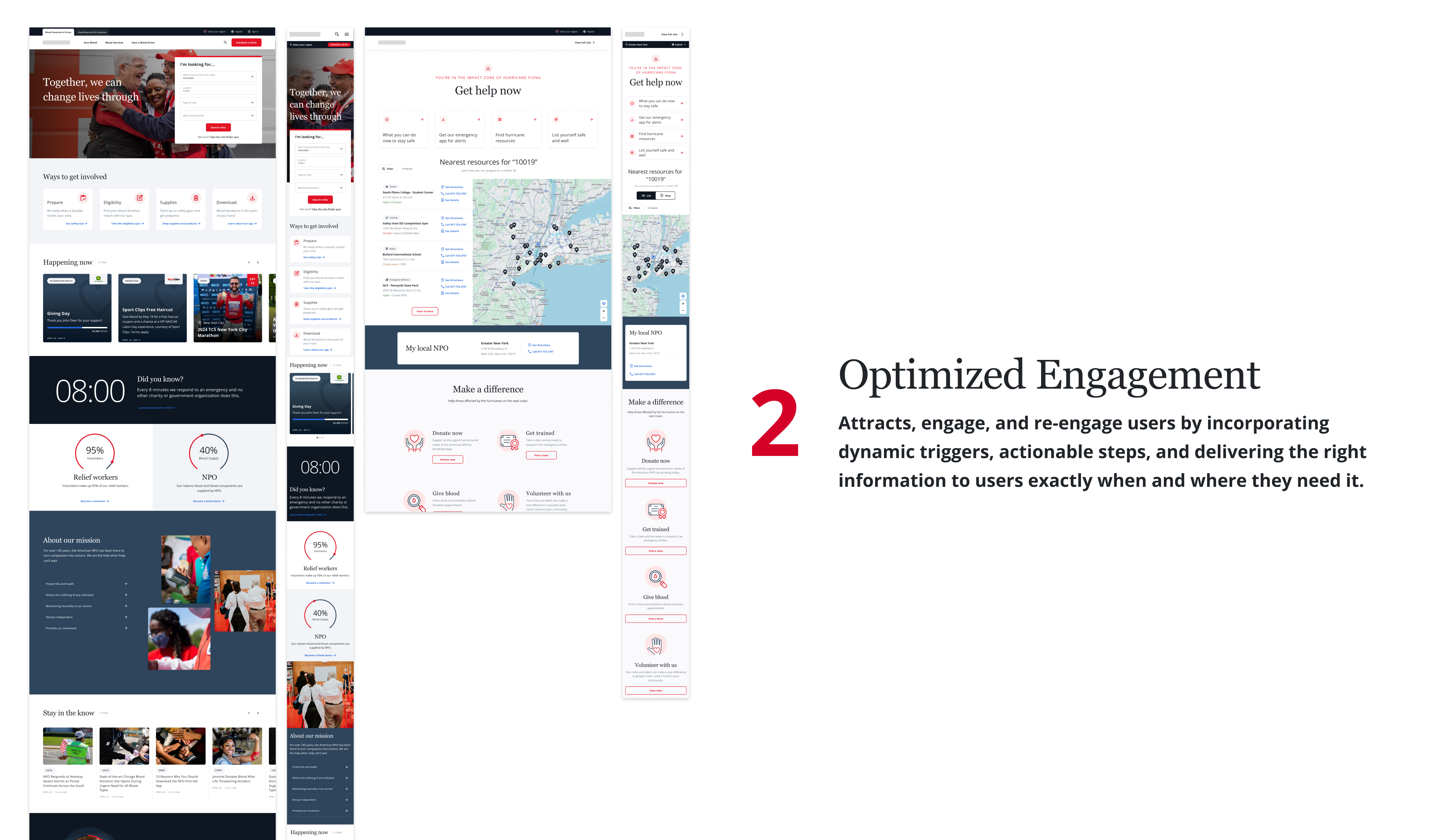
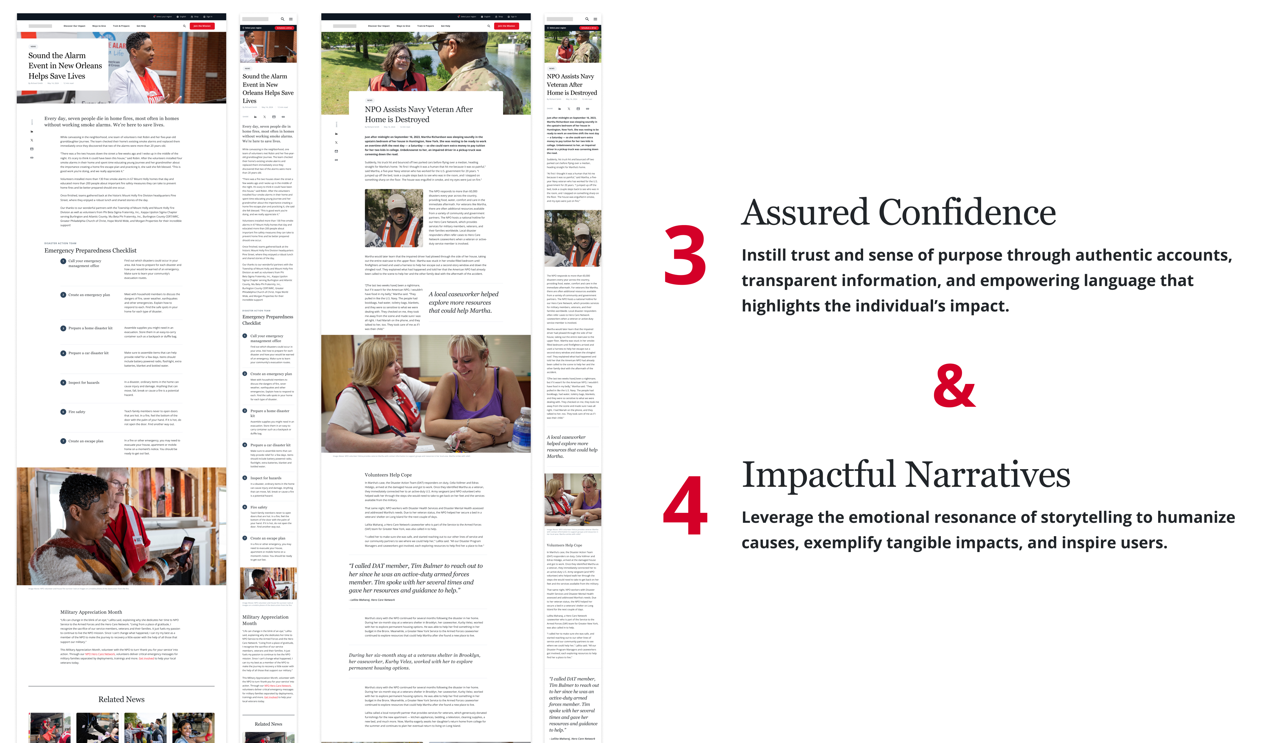
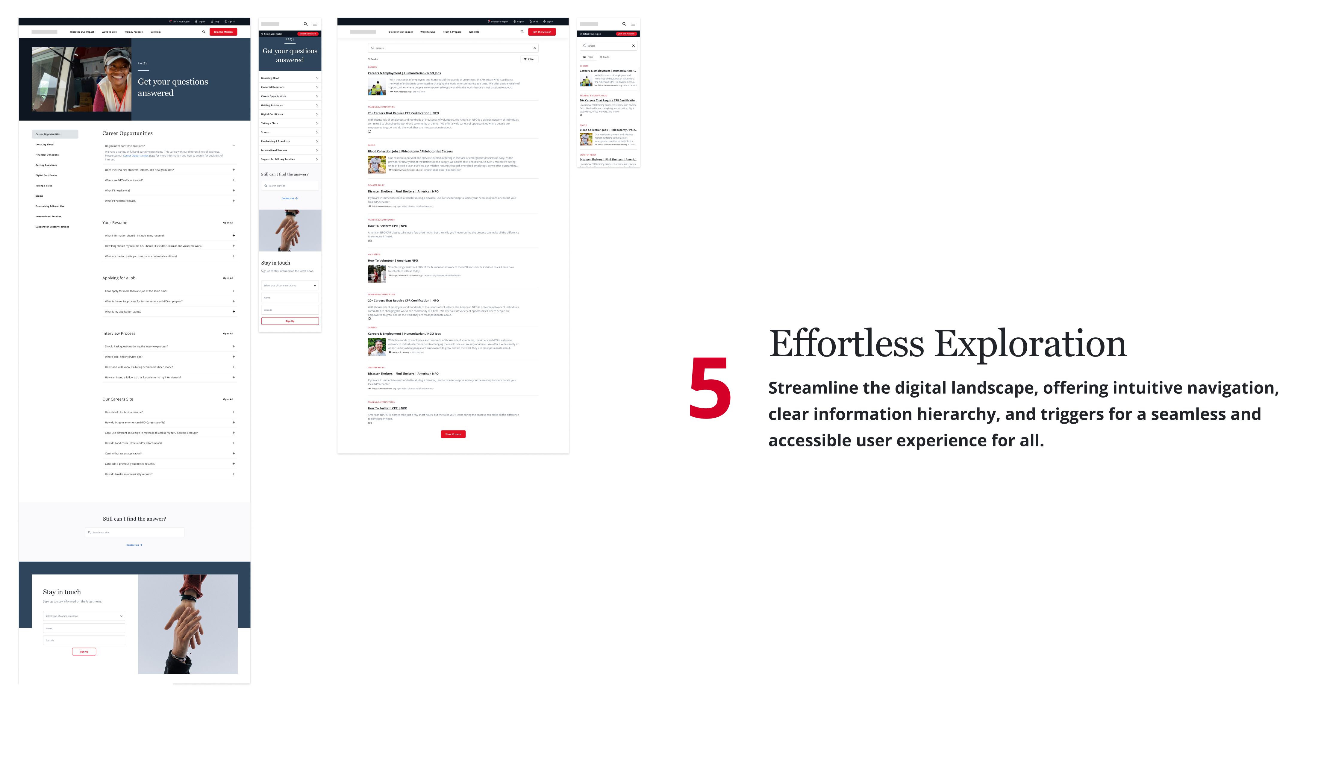
Our design philosophy is built on the next five core principles:
Every decision was an opportunity to invite someone in. WCAG 2.2 AA at every layer of the system.
Consistent language, scannable hierarchy, and clear next steps across the entire ecosystem.
Visual signals - testimonials, transparency, donor stories - that earn confidence before asking for action.
Emotional storytelling at the heart of the experience, reflecting the mission of the organization.
Every screen invites users to do something - donate, learn, share - with frictionless paths to participation.
The next step is to bring our design to life with an interactive prototype. We'll then test it with real people to see how they interact with it.
By watching how users navigate and listening to their feedback, we gain valuable insights into what they like, what frustrates them, and what they need. This helps us refine the interface, making sure it's intuitive and enjoyable for everyone who uses it.
Accessibility isn't about compliance - it's about dignity. Every design decision was an opportunity to invite someone in, or shut them out.
Collaboration drives quality. Working with teammates like Tara (UX) and Jess (UI/Accessibility) elevated my own approach and made the product stronger. The power of team vibes.
There's much more to say about this project. If you're interested in learning about the challenges we faced and how we overcame them, feel free to reach out to me.
I'd be happy to share more insights.
Contact me!→