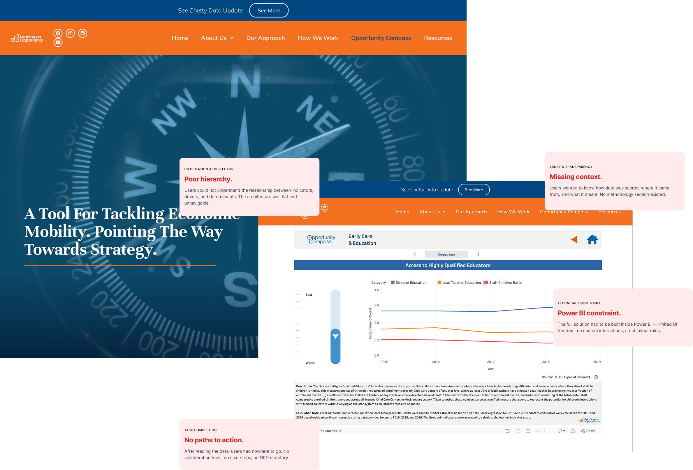
Poor hierarchy.
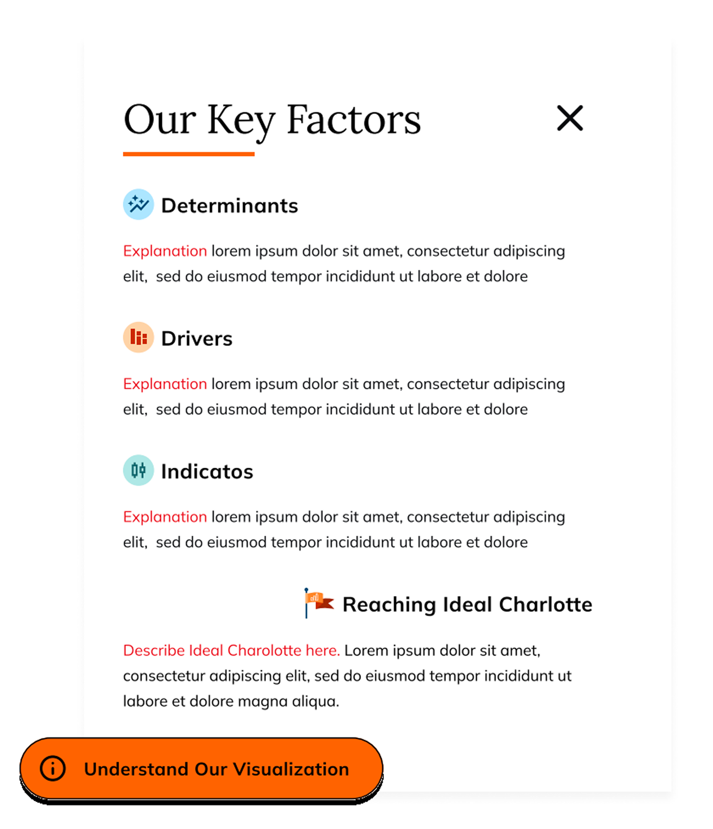
Users could not understand the relationship between indicators, drivers, and determinants. The architecture was flat and unnavigable.
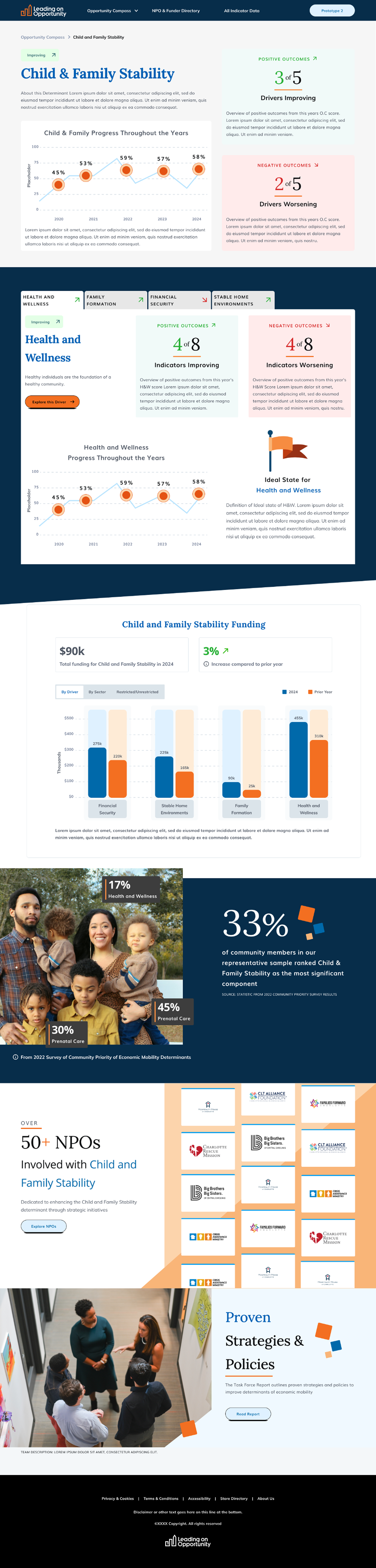
Transforming complex economic data into a clear, actionable platform for funders and nonprofits in Charlotte, NC.
The result: an entry-point overview that carries an 82-indicator dataset without overwhelming anyone - every chart type chosen against real Power BI constraints, and the core layout settled by an A/B test instead of opinion.
Getting there meant turning that dataset - 82 indicators rolled up into 22 drivers and 5 determinants - into something funders and nonprofits could act on, built entirely inside Power BI. As UI owner and prototyping lead on a 2-designer team, I owned the visual system, end-to-end prototyping, chart-type research, the A/B test, and developer handoff.
Users could not understand the relationship between indicators, drivers, and determinants. The architecture was flat and unnavigable.
Users wanted to know how data was scored, where it came from, and what it meant. No methodology section existed.
After reading the data, users had nowhere to go. No collaboration tools, no next steps, no NPO directory.
The full solution had to live inside Power BI - limited UI freedom, little native support for custom interactions, strict layout rules.
"Opportunity Compass 1.0 gave the sense that everything is bad and nothing is moving." - Participant on Compass 1.0, usability read-out
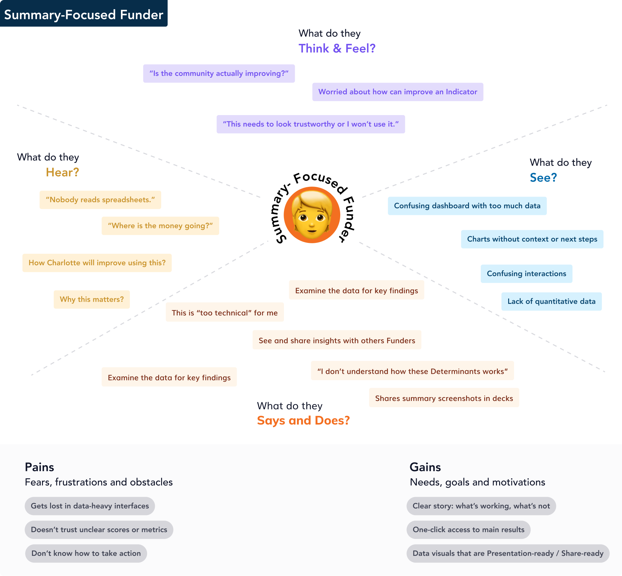
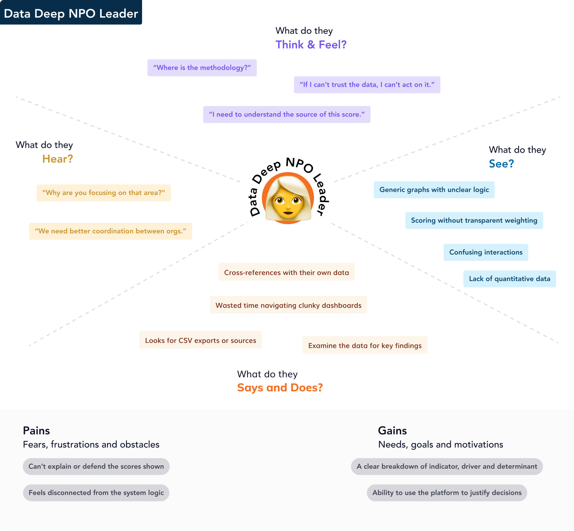
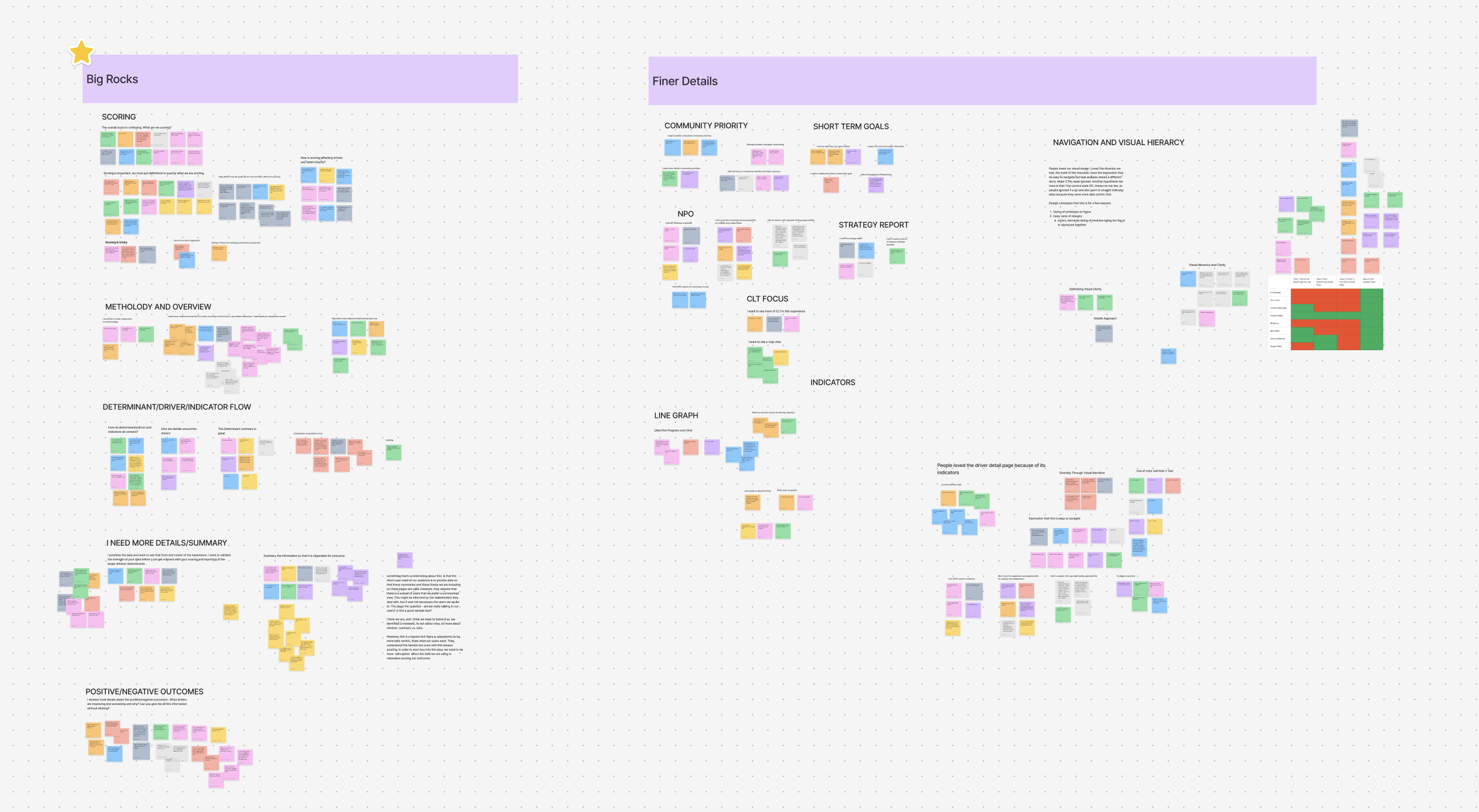
Some users were landing directly in the tool without prior context - confused from the start. This led us to propose a dedicated landing page as an onboarding entry point, giving each user type a guided path into what mattered most to them.
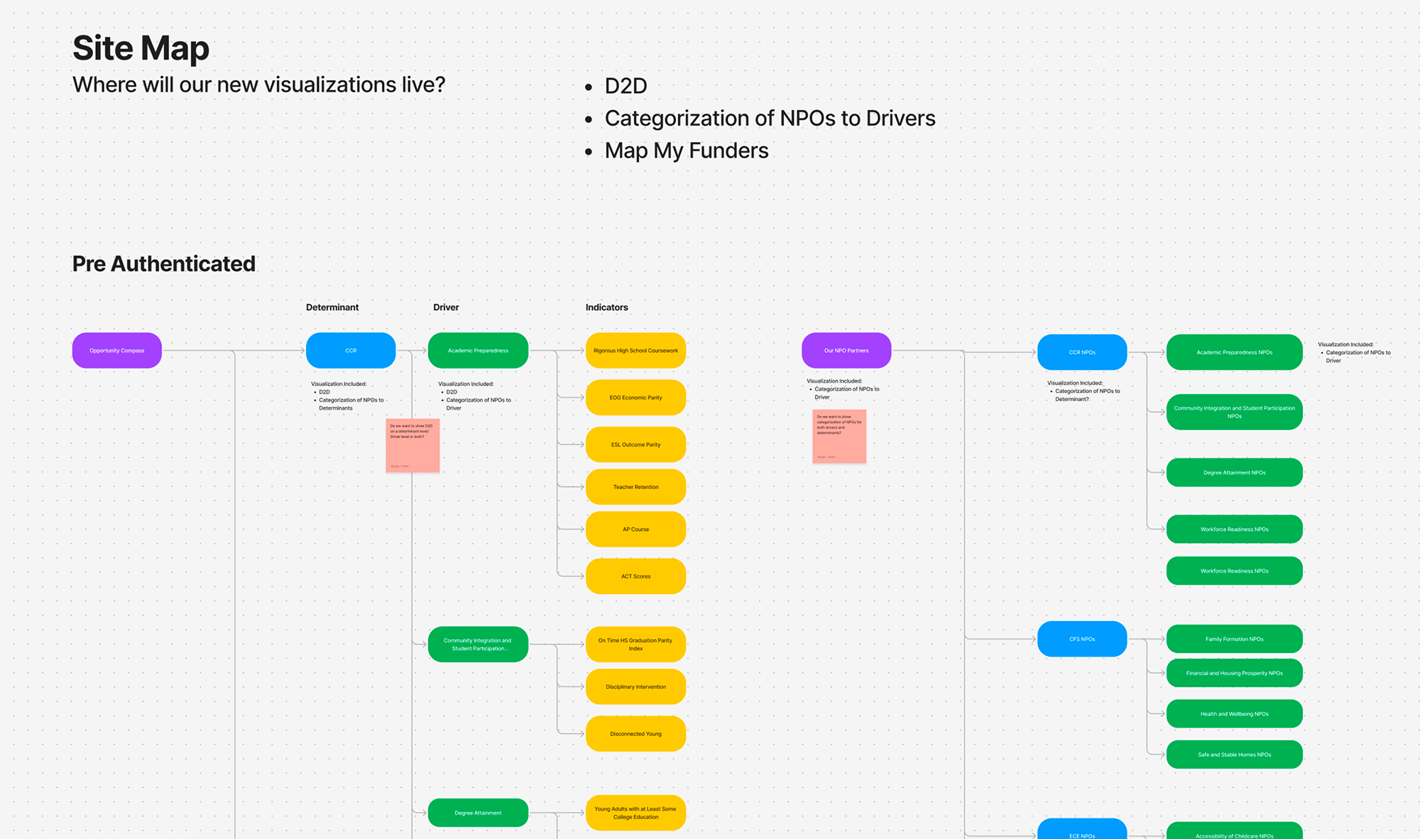
Users were dropping into the tool cold, with no context. I proposed a dedicated landing page to explain the platform's purpose, structure, and data sources - and route each user type to what mattered most.
Two ways to compare determinants and drivers were prototyped head-to-head: a radar chart with click-to-expand axes, and a custom-built tabbed navigation component. Tested with 9 users across funders and NPO leaders.
Every chart type was evaluated against 4 criteria: cognitive load, data integrity, Power BI feasibility, and shareability. Three types survived untouched, the bubble chart was refined from user feedback, and the radar view lost a head-to-head A/B test.
Data-centric users would not act on a score they couldn't interrogate. I added a content-only methodology page explaining how indicators roll up into drivers and determinants, and how the overall score is built.
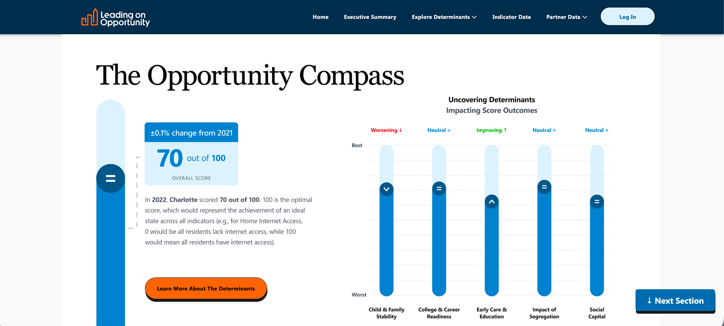
Shown an overall progress score with no framing, 100% of users asked "58% of what?" I added definition and context around the score at the overall, determinant, and driver level.
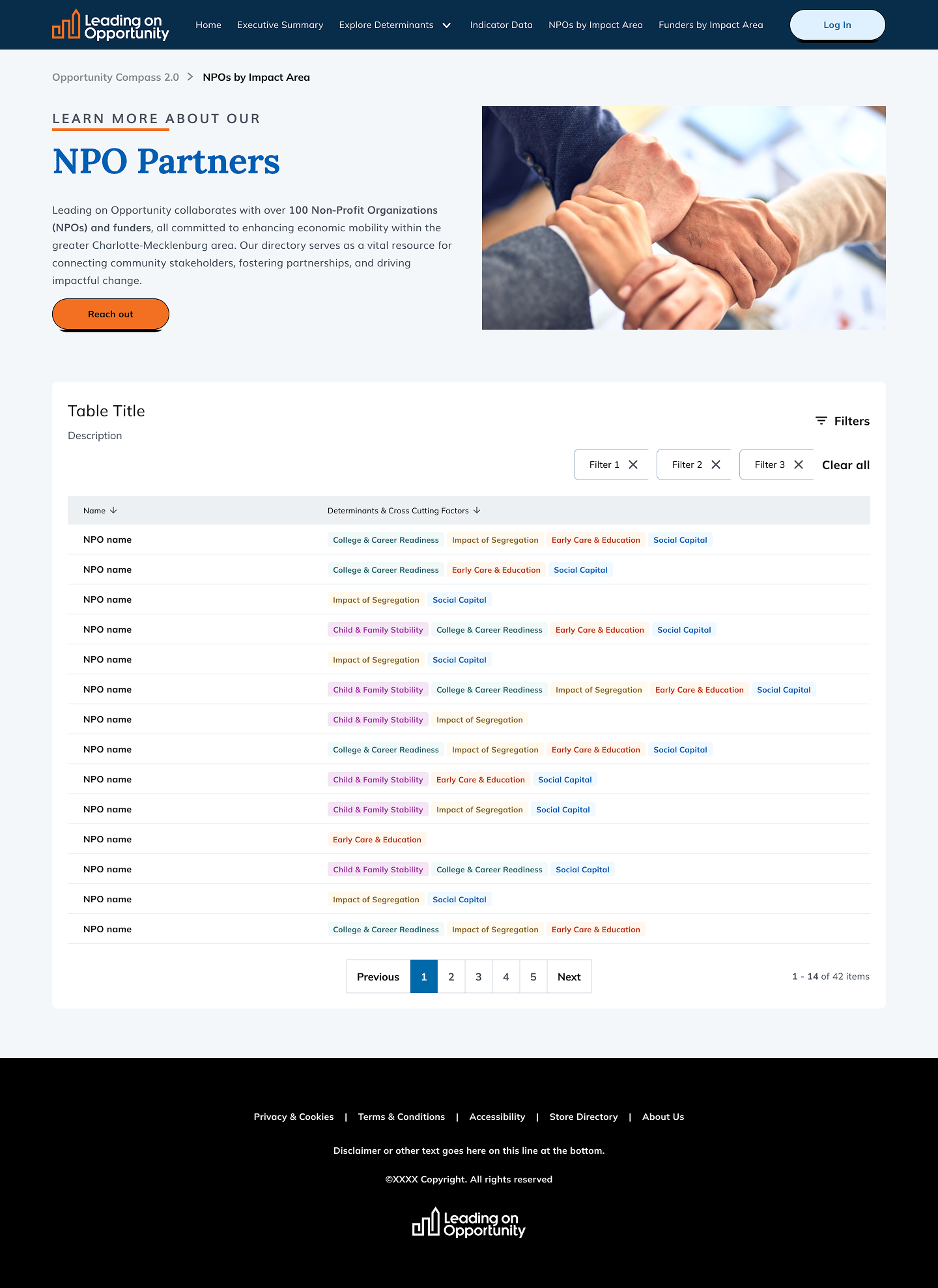
During testing, NPO leaders expressed a need to find and connect with other organizations in their area. We proposed an NPO Directory - filterable by region and impact area.
| Chart type | Use in product | Decision | Why |
|---|---|---|---|
| Bar / column | Overall funding by determinant | Kept | No usability issues - only a copy fix (sector label + numeric dates). |
| Line | Yearly progress per determinant (2020–2024) | Kept | No negative usability findings reported. |
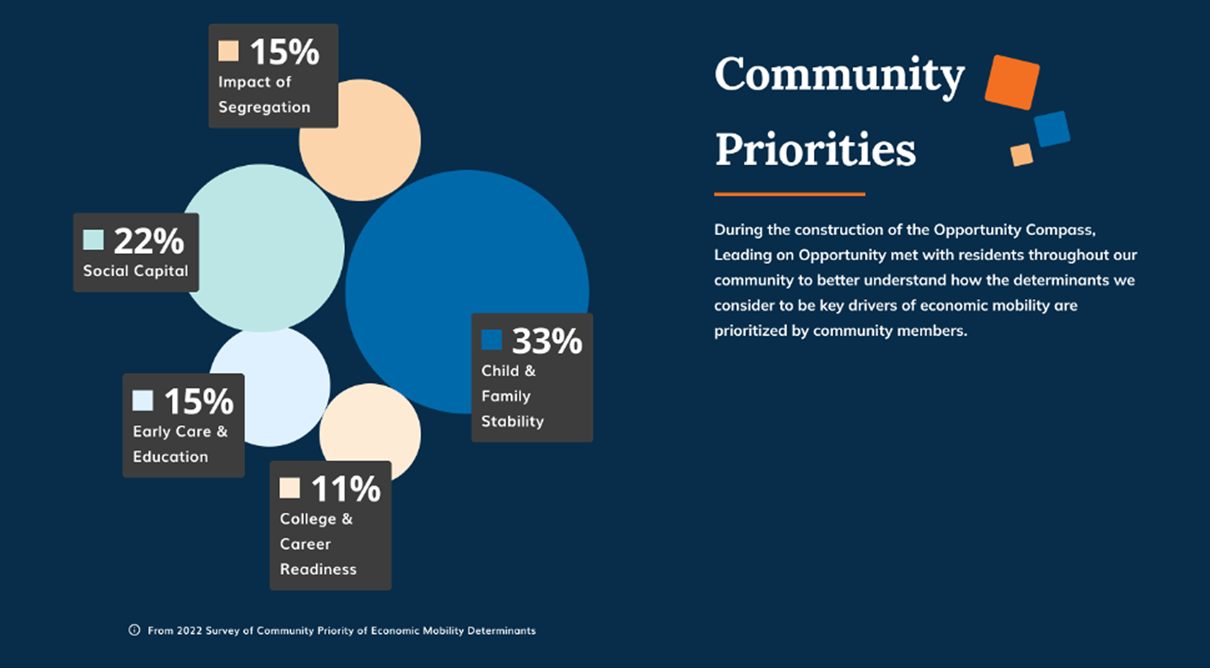
| Bubble | Community priorities (% by determinant) | Revised | Users found it distracting and hard to compare sections. Simplified and given context - a low-effort fix rather than a cut. |
| Radar | Determinant detail, click-to-expand per indicator | Discarded | Lost a head-to-head A/B test against a custom-built tabbed nav component - more disruptive and harder to use. |
| Vertical gauge / track | Overall score + per-determinant entry point (landing) | Kept | No usability issues reported - used as the landing entry point, separate from the radar/tabs test. |

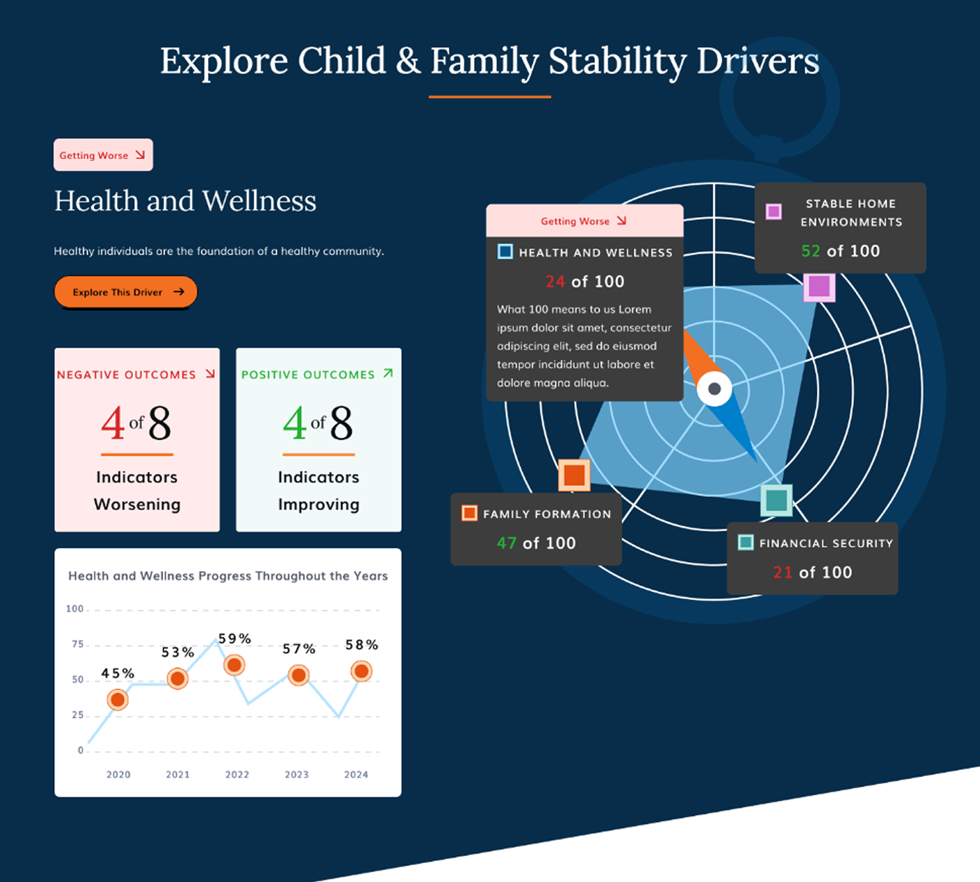
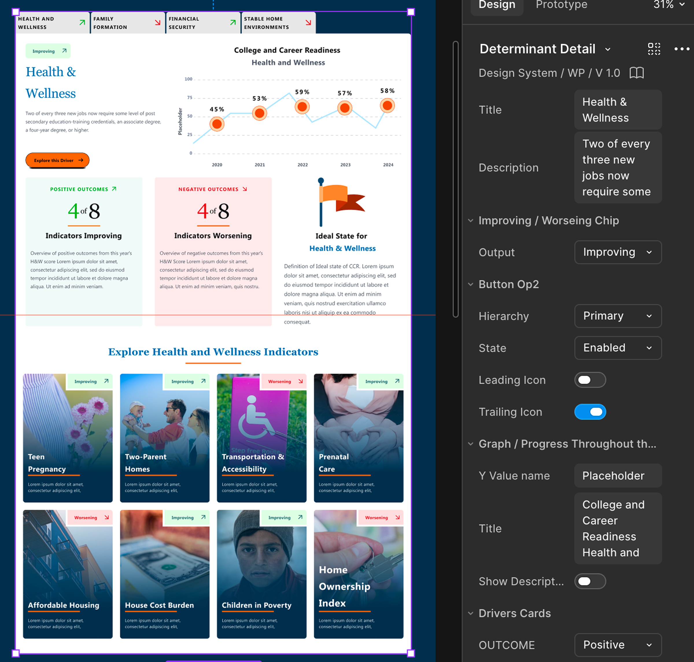
Task-based moderated usability tests + A/B comparative analysis. 5 funders, 3 NPO leaders, 1 undefined. Mix of new, infrequent, and current users.
"After exploring the indicators, the narrative around drivers and determinants started to make more sense."
"I trust your top-level data because I trust your bottom-level data."
"Love the summary… easy to see exactly what is working and what is not."
Validated through moderated testing, not launch analytics adoption tracking wasn't part of this engagement. What the work can show is behavior change: users who called Compass 1.0 "everything is bad and nothing is moving" left the new experience able to read progress in context and navigate the hierarchy on their own.