Pay a tax in under 3 minutes.
Create an application in which the users can pay a mandatory tax in less than 3 minutes.
Welcome aboard! - paying a mandatory tourism tax in less than three minutes.
Create an application in which the users can pay a mandatory tax in less than 3 minutes.
Understand to create and offer an experience where users can quickly pay a tax and receive a payment ticket - what would motivate them to make a payment, what needs they have, why they are always in a hurry, etc. Always keeping in mind the time required to do it.
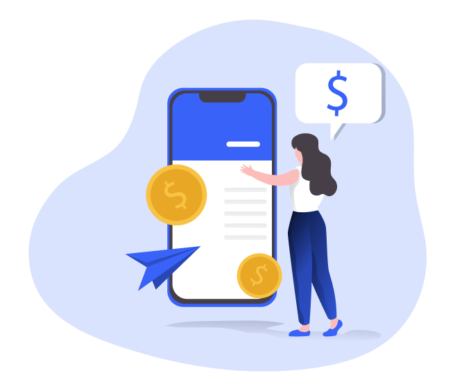
The business core for TaxPayment App was based on providing a fastest and comfortable way for the users to pay their taxes, using several APIs across the authentication process such data extraction, verification and payments.
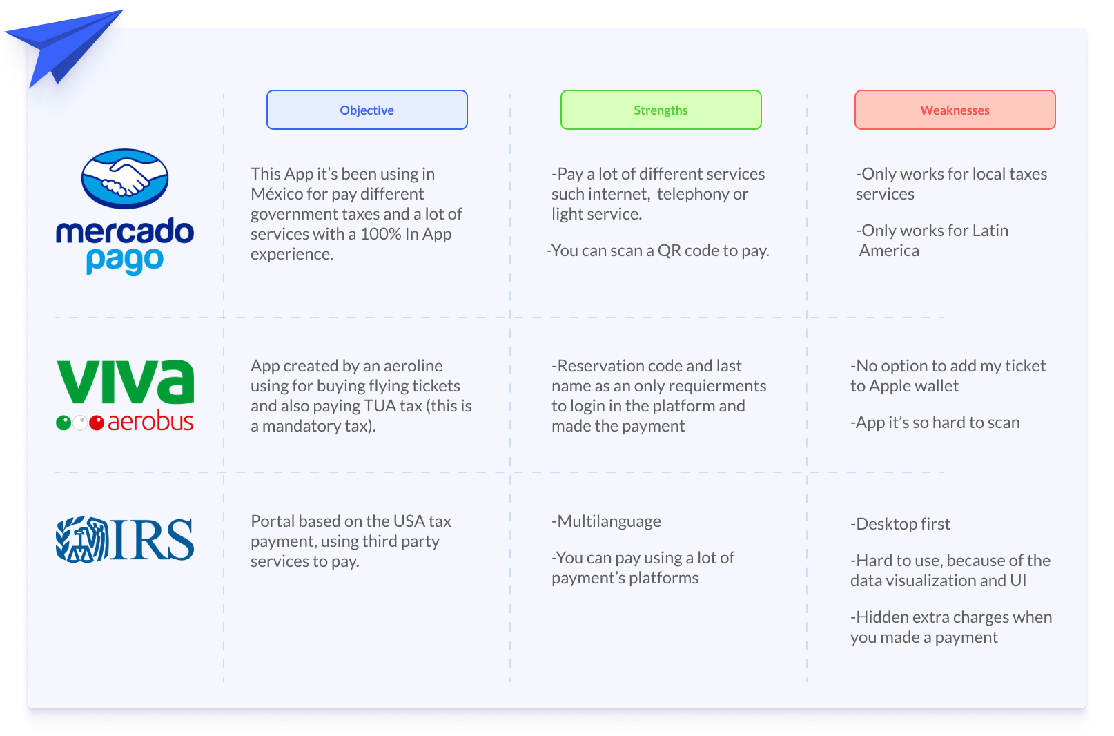
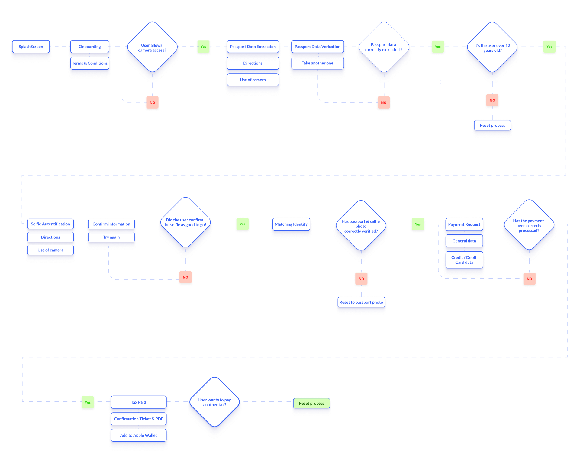
After benchmark were done, I had a clearly perspective of who the user is. Moving on the user flow creation helped me to detect where and how the user can navigate our product. Also, I can anticipate all those potential errors and design solutions for a better experience.
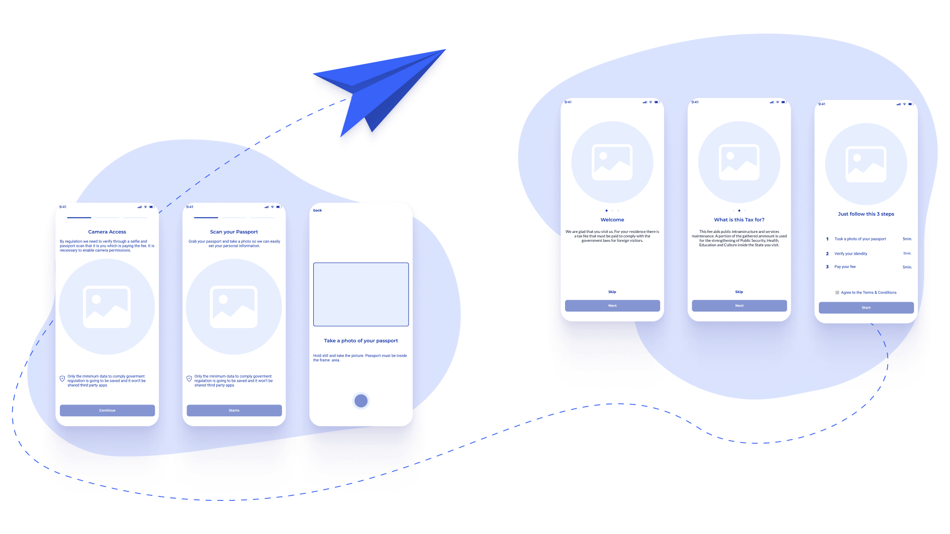
As soon as user flow was done, I jump to wireframes and started to had meetings with whole UX & Development team looking for insights before we presented this approach to the stakeholders, who became very happy with the work done.
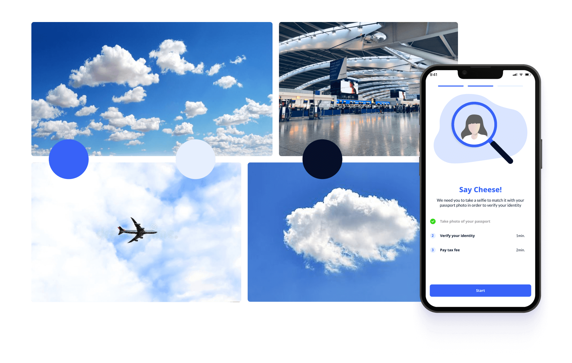
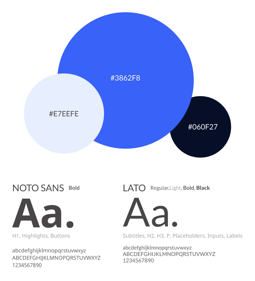
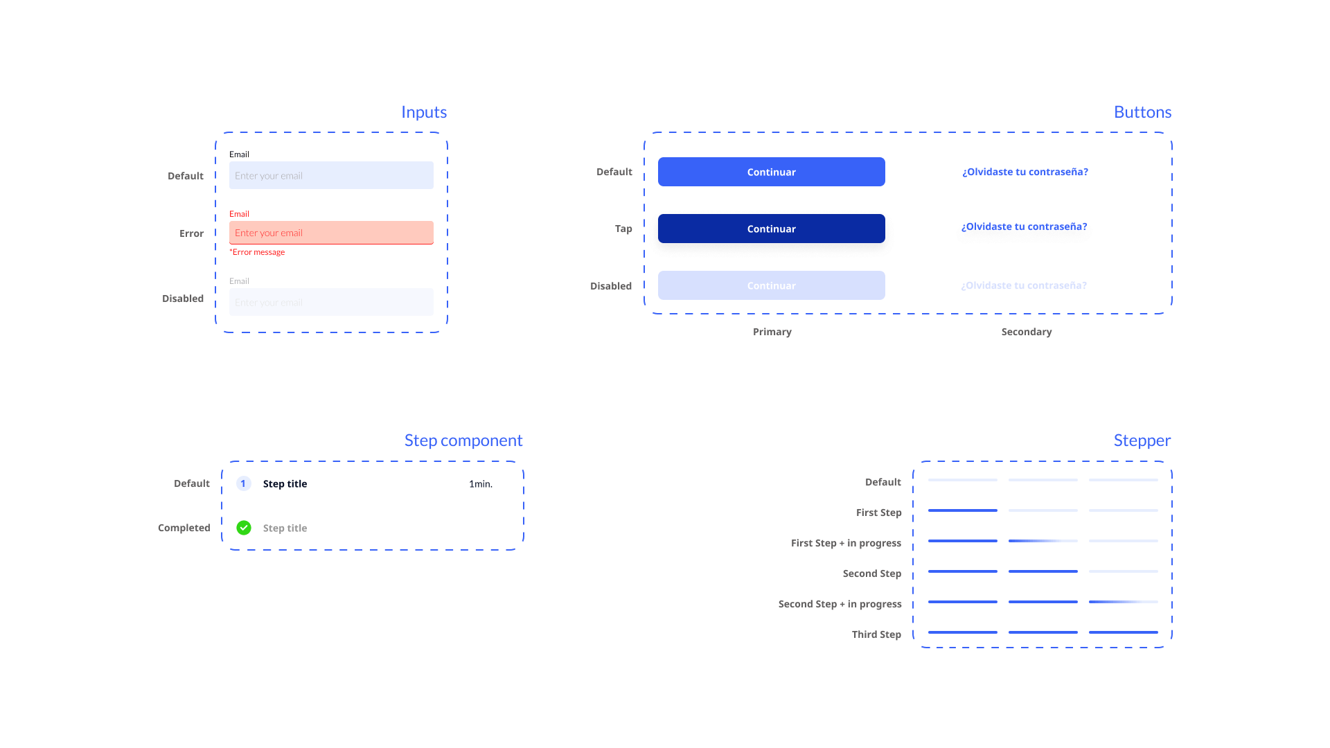
Colors and fonts were carefully selected so they would match a light and secure experience, so users feel confident when sharing their personal information and pay their tax fee.
I used Figma, making components to enhance my workflow and be agile.
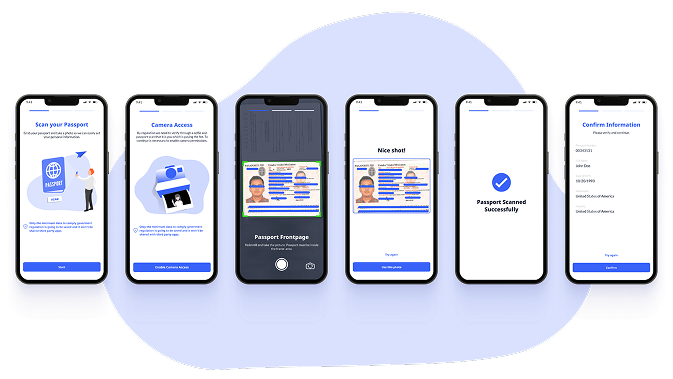
Users can scan and extract data from their passport, just allowing camera access and taking a photo inside the frame. Also, the application always keeps the user accompanied all the time, providing instructions for use. APIs processed the picture and save it for using in the next selfie's matching step.
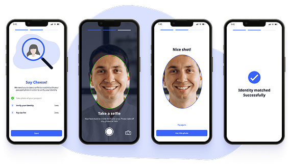
Say cheese! and take a selfie, it's that simple. Users need to take a photo using frontal camera and getting their face inside the frame, and the APIs do the rest, processing the photo and save it to compare with the previous passport photo.
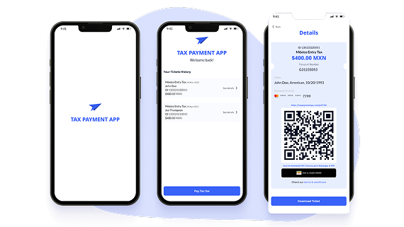
These screens works as a clearly payment process, showing user what he needs to do this last step. Fulfilling a form for pay the tax and receive a purchase ticket and the possibility to add this ticket to Apple Wallet (only iOS devices).
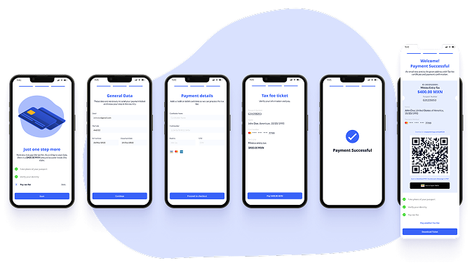
Last but not least, users can revisit their payment history and download the ticket whenever they want or just do another pay.
When we began the investigation, I didn't imagine that we would come to such a great solution, in just 4 weeks. I feel satisfied with the process I followed, and thanks to @Nicolás del Real, he guided me throughout the process and we take very good decisions.
The time to sit and investigated users and other applications was quite rewarding. My biggest challenge was the APIs things, since it was an unknown topic for me - but working hand to hand with the development team, we found solutions that provides great value for the user and that gives me the opportunity to create a very good experience.
In conclusion, the entire roadmap was a success and the methodology used was ideal for me. Adapting and being in constant communication with the team and stakeholders was key for me. Thanks to all the team.